This feature can be used in combination with other accessibility settings such as ‘Bold Text’, ‘Colour Filters’ and ‘Invert Colours’.
- Tap the ‘Settings’ icon on your home screen. Fig 1.
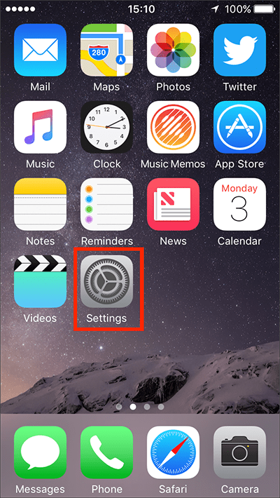
Fig 1 - Tap on ‘General’. Fig 2.
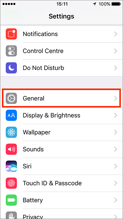
Fig 2 - Tap on ‘Accessibility’. Fig 3.
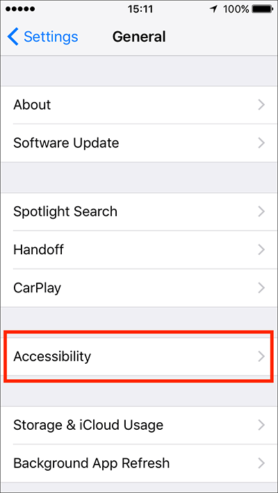
Fig 3 - Under the ‘Vision’ section, tap on ‘Increase Contrast. Fig 4.
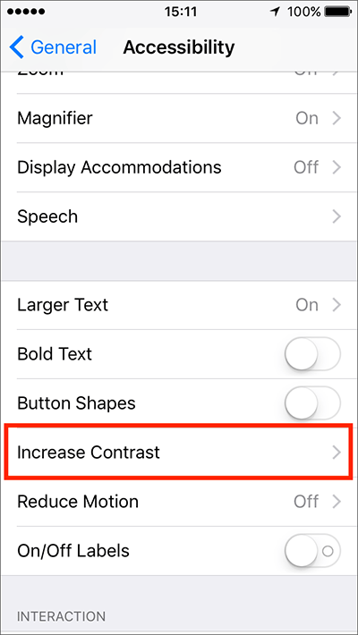
Fig 4 - To reduce the transparency of app backgrounds so that text is more legible, tap the toggle switch next to ‘Reduce Transparency’. Fig 5.
- To darken the text used throughout the iOS interface, tap the toggle switch next to ‘Darken Colours’. Fig 5.
‘Darken Colours’ doesn’t have a drastic effect but it does make the blue ‘button’ labels and some of the light-grey text easier to read. You can combine ‘Darken Colours’ with ‘Bold Text’ for greater effect.
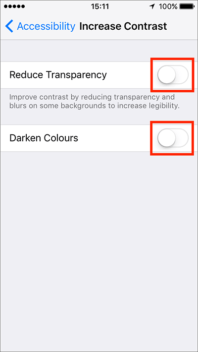
Fig 5 - When you are happy with your settings, either tap ‘Accessibility’ in the top left of the screen (Fig 6) to return to the main ‘Accessibility’ settings screen or press your device’s ‘Home’ button to return to the home screen.
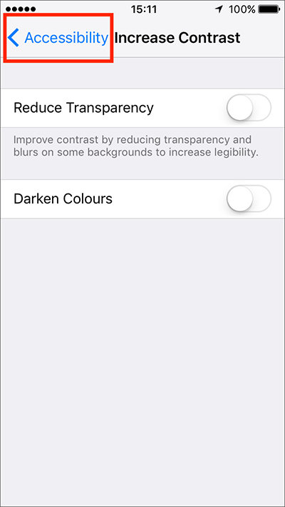
Fig 6
More information:
Need some more help?
Call our helpline 0300 180 0028 or email enquiries@abilitynet.org.uk
Need free IT Support at Home?
If you are older or disabled and need IT support at home, you can book a free home visit.